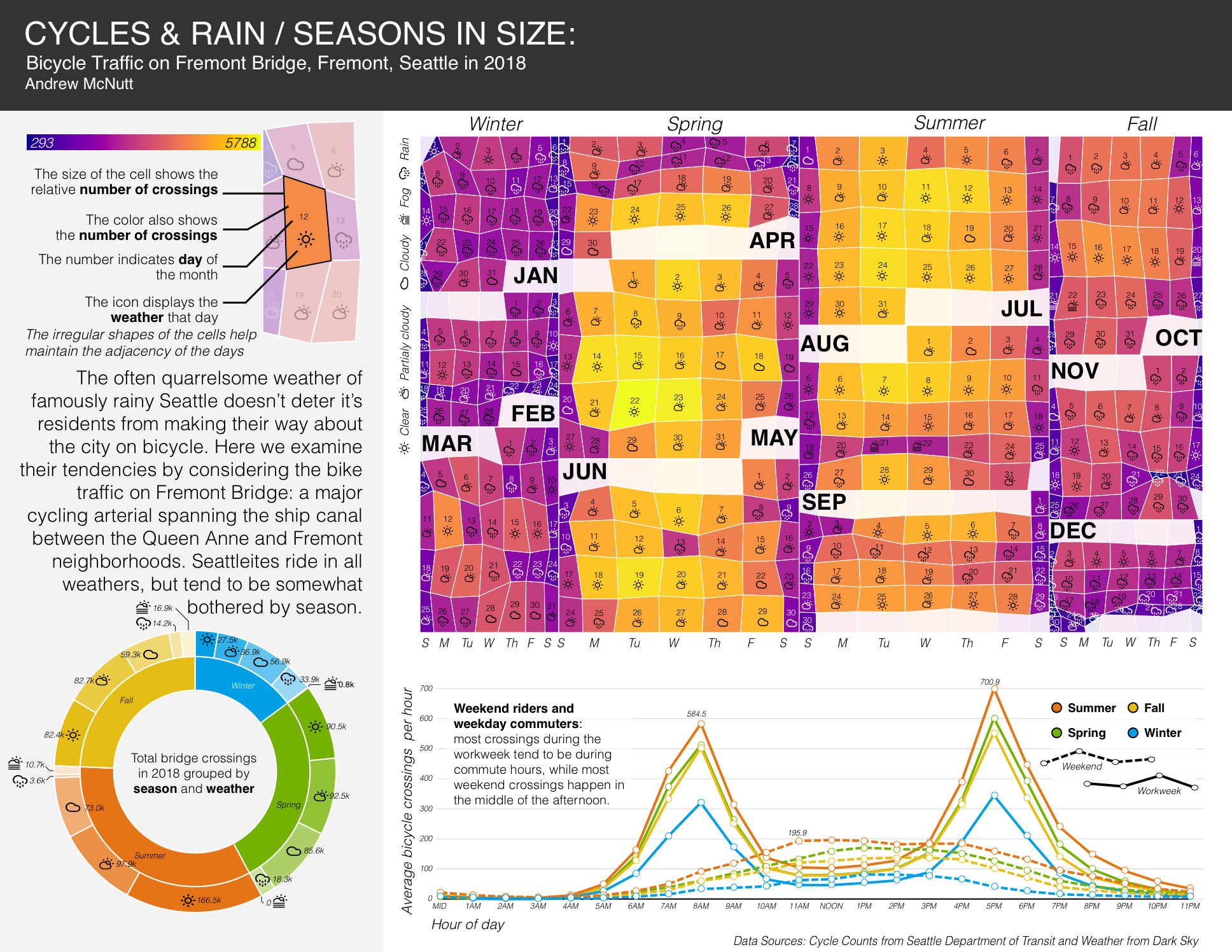
This graphic tells a small story about bicycle traffic on the Fremont bridge in Seattle Washington through the course of 2018. It does so using a traditional graphic (a line chart), a fashionable but unusual chart (a sunburst), and novel chart type (the table cartograms nested into a treemap). The table cartogram encodes tabular data through the areas of a grid while maintaining the adjacency of that grid and keeping everything bound within a rectangle, which imparts the irregular shapes to the rectanges. This unusual graphic arises from-but is considered only in passing by-academia. We make a table cartogram of each of the months in the year and place them in a proportionately-sized treemap. From this combo we are able to see a number of dimensions and granularities simultaneously: the relative popularity of travel during the weekend to the workweek, that no one rides during thanksgiving, that the Fremont bridge is mostly uncorrelated with the University of Washington's academic calendar, and the popularity of summer compared to winter.
 (click image for full image)
The table cartogram is a close relative of the geographic cartogram (a type of visualization which embeds data through the area of bodies in a map) although cast into an abstract, or non-geographic, light. It is also related to a wide family of area encoding visualizations like the mosaic plot, the pie chart, the waffle plot, and many others. Table cartograms provide an interesting advantage over many of these alternatives in that the fiercely maintained grid offers a two dimensional relationship which is either entirely unavailable or can become highly distorted in other contexts. While they might seem cartoonishly inappropriate in many settings, they offer a xenographic effect that is (hopefully) visually interesting while presenting part-to-whole data in an insightful manner. I believe that table cartograms have an interesting future: they seem to be most useful for presentational graphics where order is intrinsic to the data (like the calendars seen here), they are likely useful for textile physicalizations of visualizations (such as perhaps in quilts), and perhaps other new and wonderful contexts.
The library that produces the table cartogram in this work can be found here. This graphic was produced by combining data published by the city of Seattle and historical weather data from Darksky. It makes use of a lot of custom javascript code (which you can view here) to calculate layout and positioning, react-vis for rendering, and sketch for visual tuning. This graphic is meant for print. To this end, it is formatted in such a way that, if you are interested you can print it out on your home printer, and it will look as intended.