What do we talk about, when we talk about cities? Often the answer is the people who live there, the food, the traffic, or novel monuments. In this project I wanted to explore the corpus of cities as a whole: what differentiates one city from another? It is, of course, easy to say that St. Louis doesn’t have an Empire State Building, but it’s a different matter entirely to see cities in context, among one another. “On The Shape of American Cities I/II” tries to answer this question by presenting readers with two pairs of metrics Square Mileage/Maximum Building Height (I) and Square Mileage/Elevation (II) for the hundred most populous cities in America.
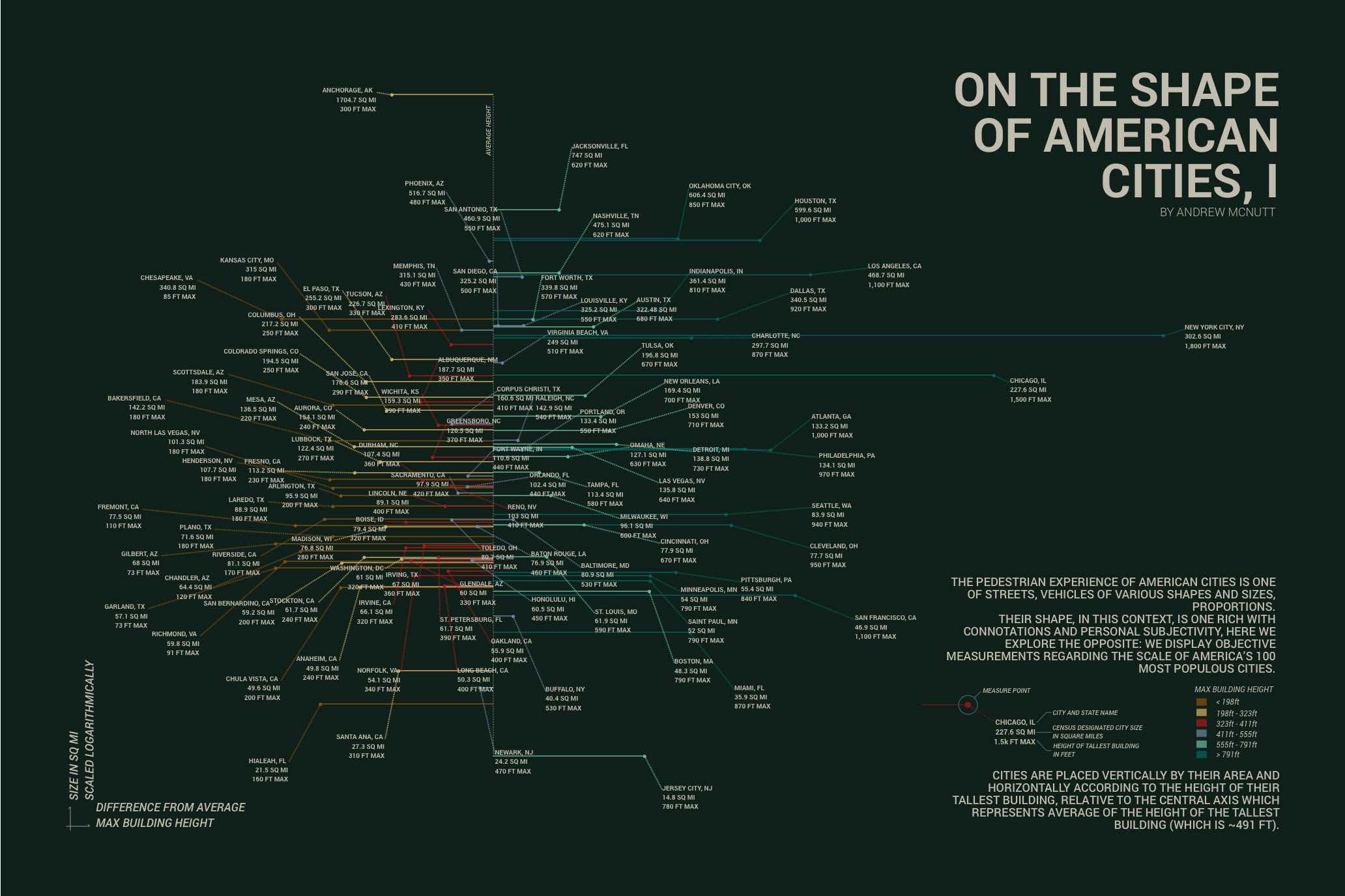
These two pieces are meant to be printed graphics, which imposes a set of limitations and challenges on their form. While most technical data graphics insist on a logical information hierarchy, in which information flows like veins or a highway road system: biggest and least detailed first then smaller and more detailed as you arrive at your terminating destination; these works instead present their finest level of detail first, just as you might find in a unusual map of place you know intimately.
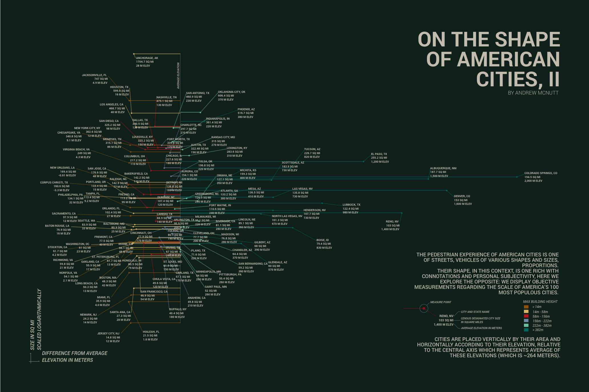
While there are of course simpler ways to convey this information, you might not have taken a serious look if it was presented in a more familiar way, such as an interactive scatterplot. Familiar graphic systems, are often familiar because they are effective, but it’s substantially easier to ignore them. It is sometimes necessary, to be less legible to be more communicative.